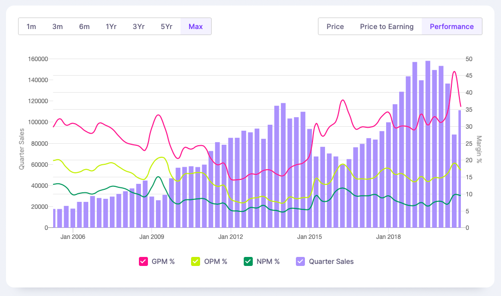
We have added a new chart that shows last 50-60 quarters at a glance. It shows the volatility in numbers and margins. It is pretty addictive once we get used to it.Performance chart of companies with quarterly sales and marginsWe borrowed this chart from Sandeep who often shared this graph on ValuePickr. Thanks to him for also doing a short chat on how he uses this graph.